Are you looking to hit a home run with your Facebook Ad campaign?
Sure you are, but before you jump into the Facebook Ad platform with all your ad lessons, ad tactics, and ad campaign strategy, you need to absorb how some of the best Facebook Ads performed in the past.
As the saying goes, “To be the best, you need to learn from the best.”
Pick some time-tested and successful ad campaign methods that businesses have used for their success.
We have figured out a variety of successful ad campaigns from various niches for you. Take it as an inspiration for your ads too.
Tighten your seat belts, as we are going to get started.
Best Facebook Ads Examples That Were Highly Successful
Our expert team members have analyzed multiple ad campaigns number by number. In addition, they have evaluated the results of many successful ad campaigns over the past few years and have filtered out a few for your next successful ad campaign.
It was hard because every successful ad is unique in its way, but we have chosen these to cover all the aspects of running a successful ad campaign.
1. Promo by Slidely
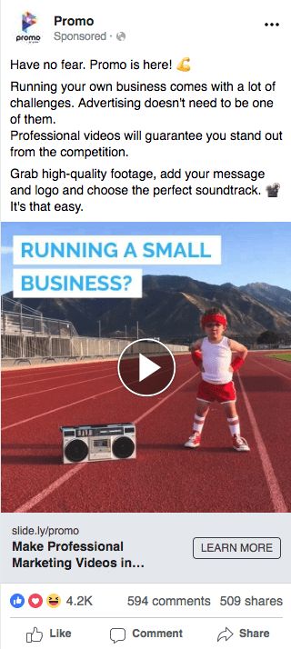
A successful ad campaign that Slidely ran for its B2B product, Promo, grabbed 2.2 million views, 4.2K reactions, 509 shares, and 594 comments. The video ad used is very catchy because of all the elements it contains.
You can make use of engaging video to run a successful ad campaign, just like Slidely did. But remember, you need to have a solid initial few seconds of the video. Don’t forget to use an attractive thumbnail to make the customer click your video ad. (If it doesn’t play automatically).
Key Takeaways:
- Visuals: Being a video ad, it engaged people within the initial seconds of the video. Slidely went different from formal and used a cute, smart, and super funny kid’s video to convey its message to small business owners.
- Relevancy: Using text in the video smartly attracts the small business owners at first; then, at the end of the cute video, a message appears ‘Make your marketing video in 5 minutes.’ The thought was to give the audience an idea of how they can also make similar videos in no time for their marketing campaign.
- Value: As everything is going digital, businesses want to tap the audience online. A small business owner can find it challenging to create videos for marketing with no knowledge of video editing. Promo can help them solve their problem in no time.
- CTA: The motive of the ad is to convert the target audience into signing up for a free trial. The ‘Learn More’ CTA button makes the viewer more intrigued to know more about making professional videos quickly, thus landing on their landing page.
2. Monday.com
Monday.com is an excellent task management tool. It is compatible with multiple operating systems for both mobile and desktop intelligent devices.

They used a brilliant idea to reach out to their target audience using a photo Facebook Ad. They created a fusion of their logo with the colors of an Apple brand to showcase the compatibility of their tool with Mac devices.
They captured the attention of all the Mac users using the traditional rainbow color scheme of Apple. Also, the ad copy is simple and to the point. It tells the audience about the launch of their new product.
Key Takeaways
- Visuals: The use of vibrant rainbow colors grabs the attention of the viewer. It helps them immediately relate it with Apple’s classic rainbow colors. In addition, it conveys the idea that the software is compatible with their Mac, and they can use the project management tool seamlessly on their Apple device.
- Relevancy: It targets Mac users who want to manage their daily tasks and projects easily on their devices. The ad is highly relevant and focused on Mac users, and it solves their doubts about any compatibility issues.
- Value: It is valuable for the Mac users as the ad calls attention to the project management tool’s compatibility with the Apple computers. It makes the user experience more valuable.
- CTA: The use of ‘Learn More’ CTA attracts Mac users to know more about the hardware compatibility of the project management tool with the Apple operating system. The page redirects towards a landing/sales page where viewers can get more information and make the buying decision.
3. Amazon
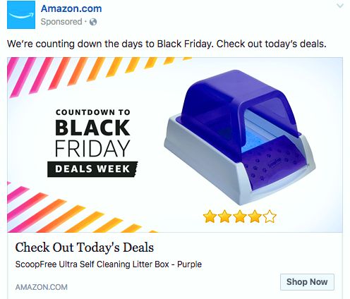
The next successful ad campaign is from Amazon. They ran this event ad and gained a lot of attraction because of the clarity of the ad. This event ad focuses on sale offers which Amazon is providing its target audience on Black Friday.
Event ads are beneficial to boost sales during a specific time of the year. Most eCommerce sites are the ones using event ads like these.
But it’s not limited to that; you can use it to attract an audience for a specific webinar, conference, or any other event in your company that is about to happen.
Key Takeaways
- Visuals: A product is featured along with its honest reviews. The image also excites the users with the text ‘Countdown to’ towards the event. The creative is subtle – the product’s color combo and the complimentary white space are appealing, thereby engaging and clutter-free.
- Relevancy: The ad is relatable to all the shopping geeks. Like, who doesn’t love discounts? It also makes the target audience aware of the upcoming deals they’ll be getting on the Black Friday sales event.
- Value: The self-cleaning litter box that Amazon has used provides immense value to all cat owners. The social proof below adds to the credibility and entices the customer to take the desired action.
- CTA: The customer flows through a slippery slide from reading the ad copy, looking at the image, and finally takes a specific action to shop on Amazon. The ‘Shop Now’ CTA is direct and takes the viewer towards the sales page of Amazon’s Black Friday event, where the viewer can scroll through all the top deals.
4. J. Crew Factory
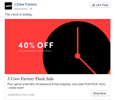
The retargeting ad example from J.Crew Factory is a pitch-perfect example of a successful retargeting ad. The complete ad triggers one emotion, and that is FOMO (Fear of Missing Out).
In retargeting ads, you don’t need to make people aware of your brand. They already know you, and you just need to create a sense of urgency to make them take a specific action.
Key Takeaways
- Visuals: The visual is appealing. Using dark shades to make it intense and a clock to clearly show that the time is limited for the 40% deal to go off the table, you need to hurry to buy at discounted rates.
- Relevancy: The retargeting ads only appear to the people who are aware of the brand. So the relevance levels are the highest for the retargeting ad campaigns.
- Value: 40% off on the product plus an additional 40% off and free shipping is a deal for people who love shopping from multi-brand chains like J.Crew Factory, where you can get a collection of men’s, women’s, and children’s apparels together.
- CTA: The CTA of ‘Shop Now’ is direct and takes the user towards the online store of J.Crew Factory. The viewers will be looking to shop as they don’t want to miss out on the discount offer, so the CTA is like the cherry on top.
5. Shutterfly
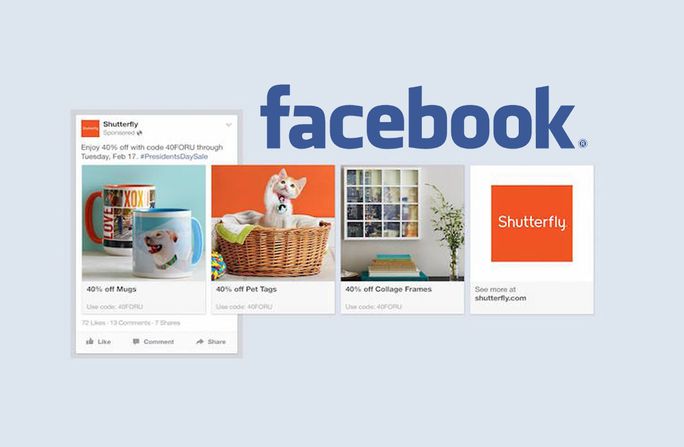
Shutterfly used this multi-product ad to make its audience aware of the different offers on its various products. One thing that is consistent throughout the images is the brand style and feel.
It is an important aspect and also helps in presenting a brand. Shutterfly used multiple products in this carousel ad.
Key Takeaways:
- Visual: The carousels have a consistency in the color scheme. This makes the ad visually soothing, easy to swipe, and rightly describes what they are promoting.
- Relevancy: People who love gifts with images and are interested in buying customized things are the target audience. It’s utterly relevant as it showcases the products the company is offering discounts on.
- Value: The advertisement showcases heavy discounts because of the President’s sale day event. The viewers can avail a discount of 40% on the listed products, which is highly valuable.
- CTA: The ad copy triggers an emotion of FOMO to grab the deal before 17 February, or the audience will miss out on the offer. It works wonders for the CTA, directly linking to the Shutterfly website, where all the discounted products are available.
6. Coyote Blues
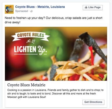
Coyote Blues used this reach ad to invite their target to have a delicious crisp salad to freshen up their day. The ad describes the food they are offering so that the viewer is aware of what’s in the offering before they decide to drive to Coyote Blues.
Key Takeaways:
- Visual: The glimpse of the product image can be seen, which gives the viewer the idea of how the salad looks. The text and design is subtle, which makes the image visually informative and appealing.
- Relevancy: It is relevant to the audience who needs to lighten up their workload and have a healthy bit of the special salad in a place near their location.
- Value: The offered salad is a healthy snack to freshen up and relax for a bit after a hectic day. It is providing value to workaholic people living near Metairie, Louisiana.
- CTA: The ad has the CTA ‘Get Direction,’ which directly connects with maps to show the exact location of Coyote Blues so that the viewer can have what the ad promised.
These were some of the successful ad campaigns that made their respective target audience take action to what the business had desired. If they can do it, so can you.
Before we wrap up our knowledge journey, let’s discuss some essential practices we learned from the above ads that you should keep in mind while creating your Facebook ad campaigns.
4 Facebook Ads Best Practices to Know
1. Make Your Goals Clear
You might have noticed that each ad had a specific goal in mind. Each company wanted its audience to take a particular action. Suppose you want to kick-start an ad campaign, but you don’t know what you want after running an ad campaign; it won’t make sense, right? So be crystal clear of your ‘Why?’
2. Be Specific with Your Target Audience
Another important thing we learned is that every ad is for a specific group of audience. They know their audience, so they targeted them specifically. You also need to select your target audience for your ads wisely. Do a little digging to figure out the best time to run Facebook ads to maximize its effect.
3. Work on Visuals and Ad Copy
All the above ads were visually attractive and had crisp, to-the-point ad copies. You need to do the same. It’s those initial few seconds that matter the most when a viewer is exposed to your ad. If you don’t engage the viewer, you will lose them.
4. Relevance of CTAs
You can’t have a different ad angle and have a CTA entirely contrary to your ad objective. Suppose if you want your audience to visit your website and shop your products, your ad copy and your CTA should align with the goal.
It’s Showtime
Now you can add all these teachings to your previous Facebook ad lessons of boosting your sales, ROI, awareness, or any other specific business goal, and take the last step of creating a successful ad campaign.
Whether you are a local or small business, you can use Facebook ads best practices to reach your audience. The Facebook ad platform is a golden opportunity to target a wide set of audiences which otherwise you might not have been able to reach. So make the most of it!
Of course, if you need a helping hand with your Facebook analytics, scheduling, and marketing, you can always use SocialPilot.

